
|
"City Boy with Chickens"
|
Artist Inspiration
|
My painting is entirely based off Van Gogh's various landscapes with people in them. Many of his works are of people going about their daily lives, doing work, sleeping on break or simply walking around town. While the people can be the center of the painting, obviously meant to be the main focus of attention, they aren't anymore detailed than the background, giving the entire piece a feeling of fuzzy-ness, like the painting was made out of focus. The less accurate, expressive lines and bright colors only add to this feeling.
These pieces are known as the "peasant genre". The focus on commoners at work and common natural landscapes were the focus of this genre, in which the focus is field workers and everyday people, going about their day. While Van Gogh has some darker pieces with less impressionistic tendencies, I based my painting off his lighter, more colorful pieces, with emphasis on how light effects the hues and colors we see. Rather than only adding black to make shading, he added blues and browns to darken the color, while keeping the colors from becoming muddy, which gives the pieces an almost whimsical, otherworldly feel common in impressionism and post-impressionism. On a more technical level, the most common elements of art are line and color. His use of lines creates the feeling of movement in his pieces, making it look like trees and grasses are blowing in the breeze and the stars are blending together. His use of color sometimes does a very good job of showing how light effects scene (like in Two Cypresses below), and sometimes doesn't make the environment look dark enough to match the environment (like in Wheat Field with Crows). Shading is usually fairly accurate in Van Gogh's paintings. The color's are fairly accurate to the natural colors (for instance in Siesta, the color of the hay bales are very close to the color of real-life hay bales, and that's true in both it's highlighted parts and it's shaded parts. While trying to emulate Van Gogh's style, I tried to use his techniques on color and painting style. I used more paint than I usually risk with how thin our canvases are, and used more free motions, rather than trying to make it as realistic as I could. The theme and meaning of my piece is similar to Van Gogh's studies, as I painted a normal person doing their everyday things. Mason was playing with chickens, the same way he does every time he comes out to my Grandma's house, just like the workers in Van Gogh's paintings are doing their jobs, or taking a break. 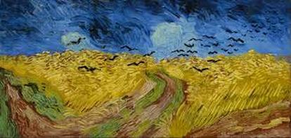
Wheat Field with Crows by Van Gogh
|
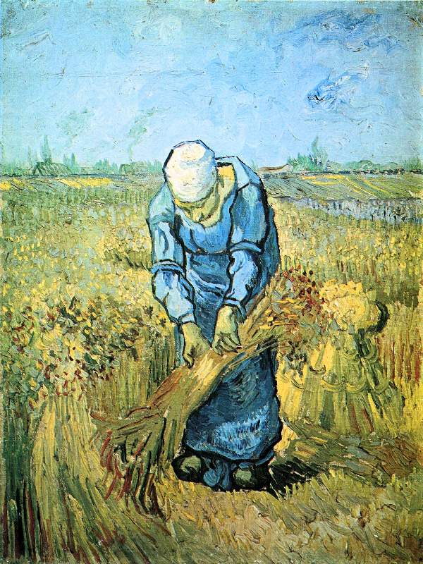
Farm Worker by Van Gogh
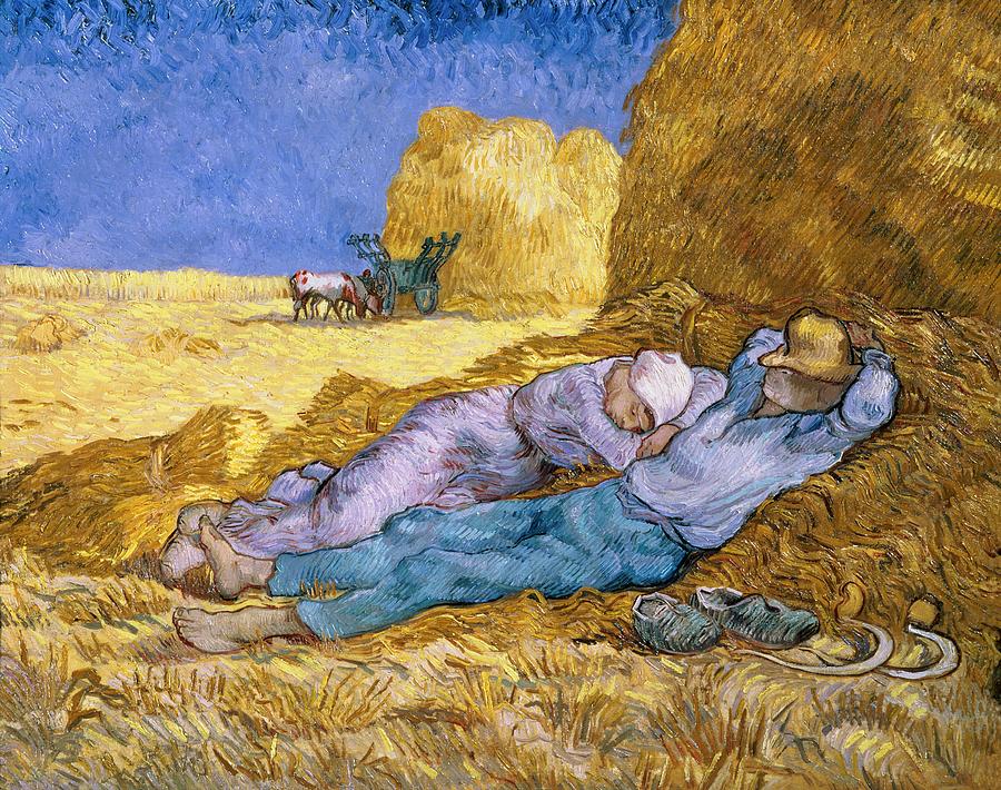
Siesta by Van Gogh
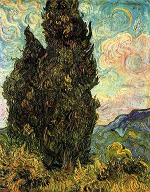
Two Cypresses by Van Gogh
|
Planning

I knew I needed a piece I could connect back to Van Gogh for my Comparative Study, and I've wanted to do a painting based off his work for a while now. Over the summer, I took a picture of my friend Mason on my grandma's farm, while he was playing with her chickens, and I liked the composition. I used that as a guide while I sketched out how I wanted the painting laid out.
That being said, I did change a few things. There was no skyline or long grass in the photo, which left a lot of green, and not much else as far as color goes. I needed to break some of that green up, so I added some long grass in the background, to give the mid-ground some more yellows and browns, and a sky line, so I could include a lighter shade of blue (and so I could paint impressionistic clouds, because that looked like fun).
The top sketch was me working from memory while in class, because I couldn't use my phone, or access my pictures. The tree was too small, the image to zoomed out, and the fences looked very miss-matched (even though they were on my grandma's farm, they looked too cartoon-y and breakable).
In the next image, I was pretty much just redrawing the photo of Mason I took. The tree was a bit off, with the trunk too small and off to the side. The scale of everything was much better, close enough that you can actually make out what the figures are. While the fences are still miss-matched and fragile looking, they look much more realistic than they did in the first sketch. I still hadn't fixed the skyline and angle, so the background still would have been nearly entirely green.
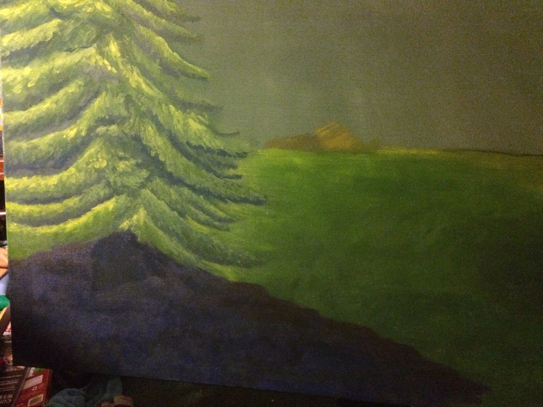
In the last image, I left the figures of Mason and the chickens the same, but fixed the background and filled in the trunk more, so the tree doesn't look lopsided. Most of the fences were pulled out, and instead I added a wheat field and a skyline in the background.
Before I started this piece, I took the time to practice painting, by tracing circles onto a piece of water-painting paper, and painting 6 spheres of various colors. I practiced blending properly with drying retardant, and highlighting and shading the spheres in a way that made them look 3D.
That being said, I did change a few things. There was no skyline or long grass in the photo, which left a lot of green, and not much else as far as color goes. I needed to break some of that green up, so I added some long grass in the background, to give the mid-ground some more yellows and browns, and a sky line, so I could include a lighter shade of blue (and so I could paint impressionistic clouds, because that looked like fun).
The top sketch was me working from memory while in class, because I couldn't use my phone, or access my pictures. The tree was too small, the image to zoomed out, and the fences looked very miss-matched (even though they were on my grandma's farm, they looked too cartoon-y and breakable).
In the next image, I was pretty much just redrawing the photo of Mason I took. The tree was a bit off, with the trunk too small and off to the side. The scale of everything was much better, close enough that you can actually make out what the figures are. While the fences are still miss-matched and fragile looking, they look much more realistic than they did in the first sketch. I still hadn't fixed the skyline and angle, so the background still would have been nearly entirely green.
In the last image, I left the figures of Mason and the chickens the same, but fixed the background and filled in the trunk more, so the tree doesn't look lopsided. Most of the fences were pulled out, and instead I added a wheat field and a skyline in the background.
Before I started this piece, I took the time to practice painting, by tracing circles onto a piece of water-painting paper, and painting 6 spheres of various colors. I practiced blending properly with drying retardant, and highlighting and shading the spheres in a way that made them look 3D.
Process
|
Before I started painting on the canvas, I started practicing painting spheres on watercolor paper. The goal was to get better at blending, but it was still useful to making the painting, even if I didn't need to blend it perfectly due to the art style. In it, I painted 6 spheres, each with different colors, which let me practice blending and creating a 3D shape. I also practiced some of the impressionistic techniques that I would need in this piece. They're less about blending, more about color theory and large patches of color with strokes in it.
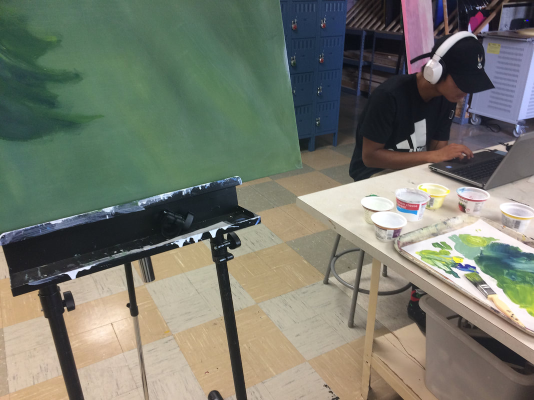
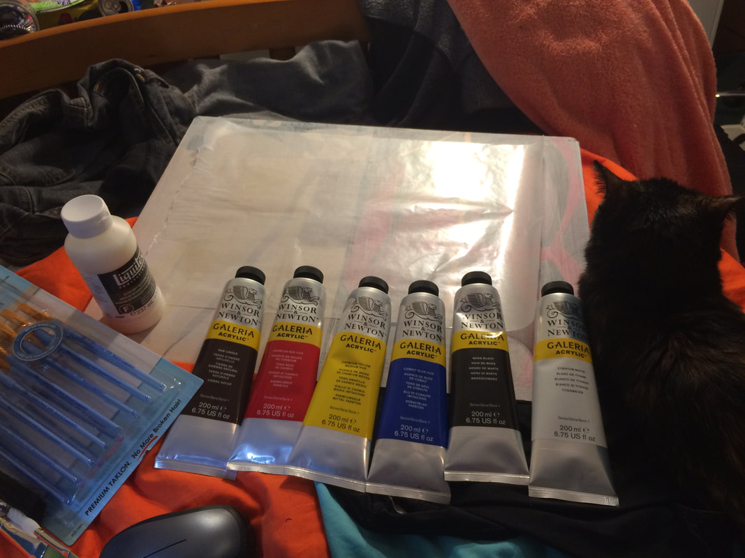
The painting took about 2 weeks in class, though I did work on it a bit at home. Because I have 2 free periods, I spent most of that time working on it, and didn't really need to take it home. I started the painting using the cheap classroom set of paints from school, but started using my own paints because they have a richer color and the yellow is less watery and transparent. I used my own brushes, most of which were flat brushes of varying sizes. I made the mistake of starting the painting with the large tree in the fore-ground, which meant I needed to carefully fill in the background after, and carefully touch up the branches that got painted over. Unlike Van Gogh, who painted with oil paints and worked with the scene directly in front of him, I was using the acrylics that were available to me, with retardant used to make them function more like oil paints. I also was painting a scene from over the summer, and It was going to take a very long time to paint. I couldn't really recreate the scene to paint it from direct reference, and instead was working from a photo I took, and painted from a studio room, rather than out in the field. Painting from a reference is good, but it's far better to paint from something directly in front of you, instead of a picture. The techniques I used in the beginning and end on the tree and wheat field was much more accurate to Van Gogh's art style than the techniques I used on the grass or sky. I should have done a better job of making sure my style matched my inspiration than realism if that's not the right art movement to use. When I touch up this painting closer to the end of the semester, I'll be sure to make the sky and clouds, and the grass more impressionistic by using less blending and more movement with brushstrokes. While emulating Van Gogh's paint-heavy art style, I needed to use a huge amount of paint, especially since oil paints are thicker than my acrylics. I used a lot of yellow, since it's used in the greens and the yellow of the wheat. I also used a lot of blue in the shading under the tree, and white to lighten up the highlights and make the yellow more opaque. As far as painting the image, it wasn't hard, other than the wheat. My main problem with painting this was finishing it quickly without getting discouraged. I don't like painting big paintings, I prefer to do more smaller ones, like I will in my Monet inspired sky paintings in my 3rd piece. |
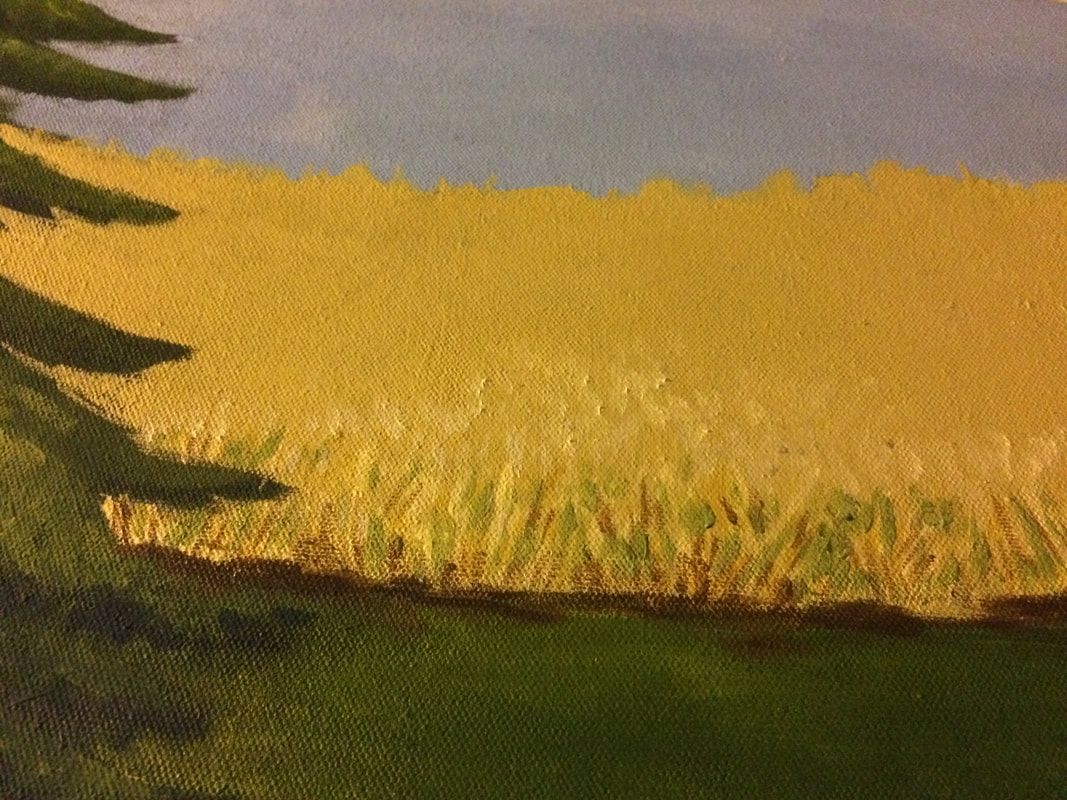
I made the canvas at school, with pre-made stretchers and a staple gun, the same way we always make our own canvases at my school. I primed it with gesso, then started painting the main green background the next day. This was back when I thought the entire background would be green, like the photo I took, but I changed it soon after I started painting the tree. At this point I realized there would be way to much green in the piece, which would mess up the overall composition, and loose the tree in the background. I started painting the more detailed grass in the front, and then repainted the sky, so it was blue. I think the sky's too pale of a blue, and would look better with more darker blues, at least as the darker parts of the sky. Lastly I started painting the wheat in the background. I had a hard time with it, because I couldn't really figure out how to show movement in it from that angle without making it look like it had no order, or was just floating around. I had to use Van Gogh's Wheat Field with Crows as a reference.
ReflectionI feel like I followed the impressionistic style better at the beginning and end, but I lost focus of emulating Van Gogh's style towards the middle of my process. The grass and sky should have more patchy lines and varying colors, and the chickens and figure should have darker colors to match the shadows and darker lines around them. I think the practice with spheres helped me get a better understanding of blending, but it wasn't that applicable to an impressionistic style, where I didn't need to blend anything. I think I got a bit carried away with it.
I also didn't get to paint the scene while it was in front of me, painting directly from life. My scene was based off a picture I had taken earlier, and I didn't want to risk the animals moving long enough for me to do a sketch. This was by far one of my favorite pictures I had taken over summer, but I did need to change some things to make it more ideal for a painting. |
Experimentation
|
ACT Questions
1. Clearly explain how you are able to identify the cause-effect relationships between your inspiration and it’s effect on your artwork.
I was attempting to emulate Van Gogh's style and techniques throughout the entire piece. I don't think I was terribly successful, and I think being more focused on sticking to his style. I used a lot of his techniques, but I think using acrylic paint was less effective at capturing this style than oil paints would have been.
2. What is the overall approach the author of your research has on the topic?
My research comes primarily from the Van Gogh Museum in Amsterdam, and so the work is very academic, but also a bit fond of the artist. They focus a lot on Van Gogh's background and how that effects what he was painting.
3. What kind of generalizations and conclusions have you discovered about people, ideas, cultures, etc. while you researched your inspiration?
There's a good amount of generalizations on what constitutes "fine art" because my research led me to investigating the Académie Royale de Peinture et de Sculpture (the French Academy of Art). They judged works of art based on their subject, and the Metropolitan Museum of Art draws some conclusions on the types of people that buy different types of art during that time period.
4. What was the central idea or theme around your inspirational research?
I needed to study Van Gogh, who it, luckily, very well researched. I know enough about him to know what I needed to research already. I knew he was famous for his peasant paintings and drawings, and that his paintings are most famous for his post-impressionistic techniques, like his use of color and line to portray movement. I just needed to do some minor research to fill in some of the more fine details, and provide scholarly sources.
5. What kind of inferences did you make while reading you research?
I needed to do some of the physical breakdowns of technique, like deciding what elements of art and principles of design he used, because I have enough experience in it to do it on my own. I used a website that goes in depth on what each of the elements of art and principles of design are, but connected them to Van Gogh on my own.
Citation
- “Van Gogh - Farm worker.” Social, www.awesome-art.biz/awesome/shop/item.aspx?itemid=255.
- “The siesta (after Millet) - Vincent van Gogh.” Google Arts & Culture, Google, www.google.com/culturalinstitute/beta/asset/the-siesta-after-millet/LwFmpmDARcicFQ?hl=en.
- Vincent van Gogh: The Paintings (Wheat Field with Crows), www.vggallery.com/painting/p_0779.htm.
- “Cypresses | Vincent van Gogh | 49.30 | Work of Art | Heilbrunn Timeline of Art History | The Metropolitan Museum of Art.” The Met's Heilbrunn Timeline of Art History, www.metmuseum.org/toah/works-of-art/49.30/.
- “Peasant Painter.” Van Gogh Museum, www.vangoghmuseum.nl/en/vincents-life-and-work/van-goghs-life-1853-1890/peasant-painter.
- Meagher, Author: Jennifer. “Genre Painting in Northern Europe | Essay | Heilbrunn Timeline of Art History | The Metropolitan Museum of Art.” The Met's Heilbrunn Timeline of Art History, www.metmuseum.org/TOAH/hd/gnrn/hd_gnrn.htm.
- “Art Elements & Principles - Clear Lake High School Art Department.” Google Sites, sites.google.com/a/clearlakeschools.org/art/art-elements-principles.
