|
"Quick Clouds"
|
Insperation
Claude Monet was an impressionist painter, well known for his Water Lilies series, which consists of over 250 paintings. All are based on the water lily garden he made near his home in Giverny, a small town near Paris.
Monet was a strong believer that any aspect of nature could hold the beauty and attention of an audience. We was quoted saying "One instant, on aspect of nature contains it all."
His style is very blurry. Lines aren't very accurate and the already dull colors blend into one another. This style was heavily critiqued by traditional art critiques. This style was a trademark of impressionist paintings, but Monet was "the Father of French impressionism", so much of the criticism of the style fell onto him. Some argued the style was laziness, or that it stemmed from him not being able to see clearly. In reality, it was an attempt to capture the "essence" of a scene. This usually involves capturing the lighting of a scene well, and painting with passion.
When he first started painting his series on water lilies, Monet had more paintings that included the shoreline and other aspects of his garden, including some that had tree branches, or his famous Japanese-style bridge in full frame. As he continued on, he started cropping them less traditionally, and focusing more and more on the surface of the water. Any trees that were in the painting were partially cropped out (see the 1903 painting below), and most only showed the water and the lilies growing on them. This was done to remove markers that people use to try and figure out where they fit into the picture. He wanted the viewer to be surrounded by the water lilies, and he even invented an oval room for them to be viewed in, so they literally surround the viewer (it was later built in the Musee de l'Oragerie, which has 2 of these special exhibition rooms with many of Monet's water lily works in them) without breaking the focus with a horizon or distant trees or shorelines.
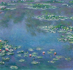
Water Lilies (1906), by Claude Monet
Currently owned by the Art Institute of Chicago |
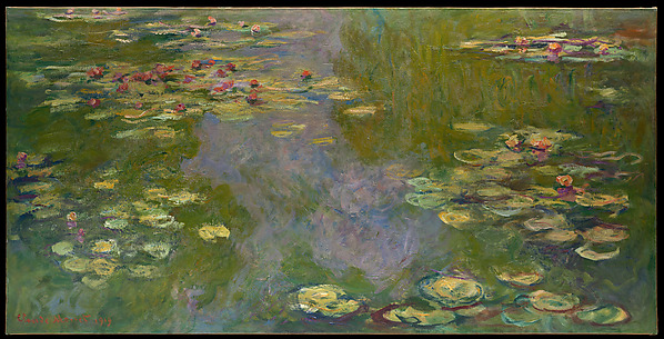
Water Lilies (1919), by Claude Monet
Currently owned by the Metropolitan Museum of Art |
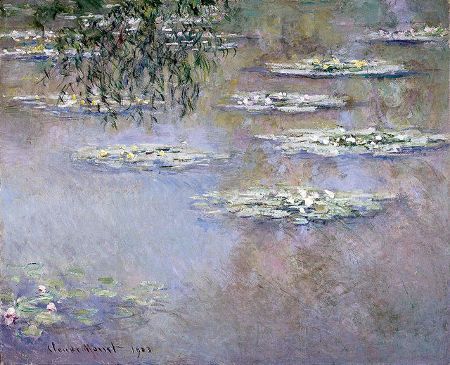
Water Lilies (1903), by Claude Monet
Currently owned by the Dayton Art Institute |
Planning
|
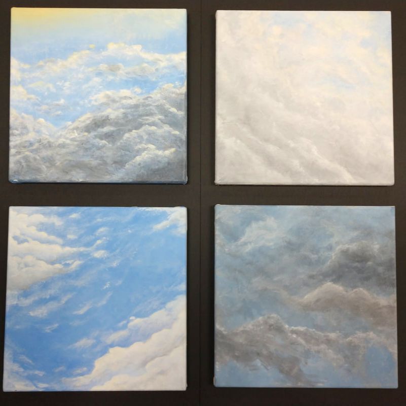
There was little planning involved in this piece. The goal was to create pieces spontaneously when I could. I tried to keep planning to a minimum, and just work on it quickly and passionately, to capture the moment, rather than planning something out and losing the passion and spontaneity. This means I don't have any planning sketches. I did, however, take pictures of the sky, to decide if I liked it cropped off a certain way, or if the picture was too imbalanced with a certain layout. I tried my best not to use these pictures as my main reference, and instead painted while looking out the window, where I could actively see the sky. The few times I did do this was if I took to long to get the finishing touches on, a piece, and the clouds had changed or it got too dark to see. I would use the photos to finish up the piece, but I tried to avoid this as mush as possible, by painting quickly and not second guessing myself too much.
|
|
Process
I tried my best to make the separate canvases as squared off as possible. If they didn't form near perfect squares, they wouldn't look like they were hung straight during a gallery. I made my own canvases using the premade stretchers from our school, but used my own paints.
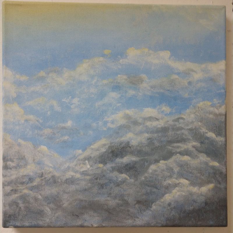
I had the same technique for all of the paintings. First, I'd mix up enough of a color to paint the entire canvas with it. I'd mix in some other colors as I went on, to make a slight gradient, especially in the ones closer to sunset or sunrise. While the paints were still wet, I painted over it with thinner paints. I would then use a dry brush to blend the color into the still wet background. This let me make the softer, less accurate shapes of the clouds without worrying too much about making the lines too harsh, or placing something in the wrong spot. I didn't need to be too accurate, but the layout of the piece is very important.
Once I had the basic shape of the clouds defined, I'd use a darker color to shade in the darker parts. This needed to be mixed with extender, so the paints wouldn't dry out while I was doing the finer details. Id layer in different shades, also mixed with extender, so they'd slightly blend, and partially blend the clouds using a dry brush.
At this point, I'd let the paint fully dry. Even with the extender, it only takes about 10-20 minutes. Now that the paint's fully dry, I don't need to worry about anything blending together anymore. I'd just do the finishing touches at this point. One way I finished up each piece was by painting on the final layers of highlights. I would make a very, very light yellow, and use that on the highlights. This makes it look like it's in ethereal, natural lighting.
Reflection
|
The main problem I had was that I would get too focused on making it look realistic, which wasn't true to Monet's style, and meant I was taking to long on each painting. These are meant to be done quickly, not necessarily accurately, but I always find that hard to do. When I took too long on one painting, the paints would dry, and they wouldn't blend properly.
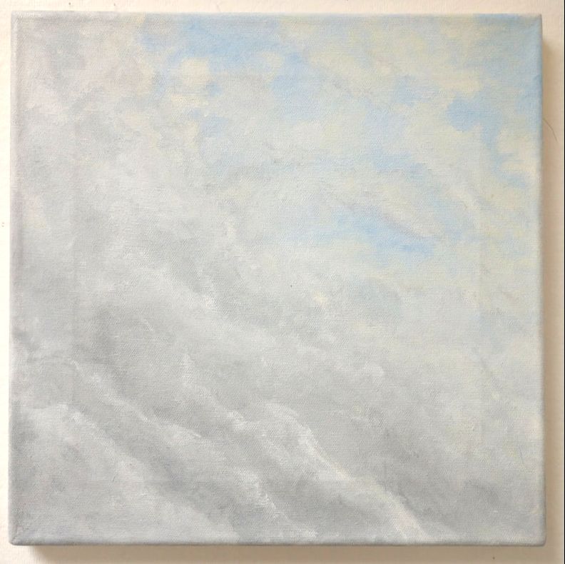
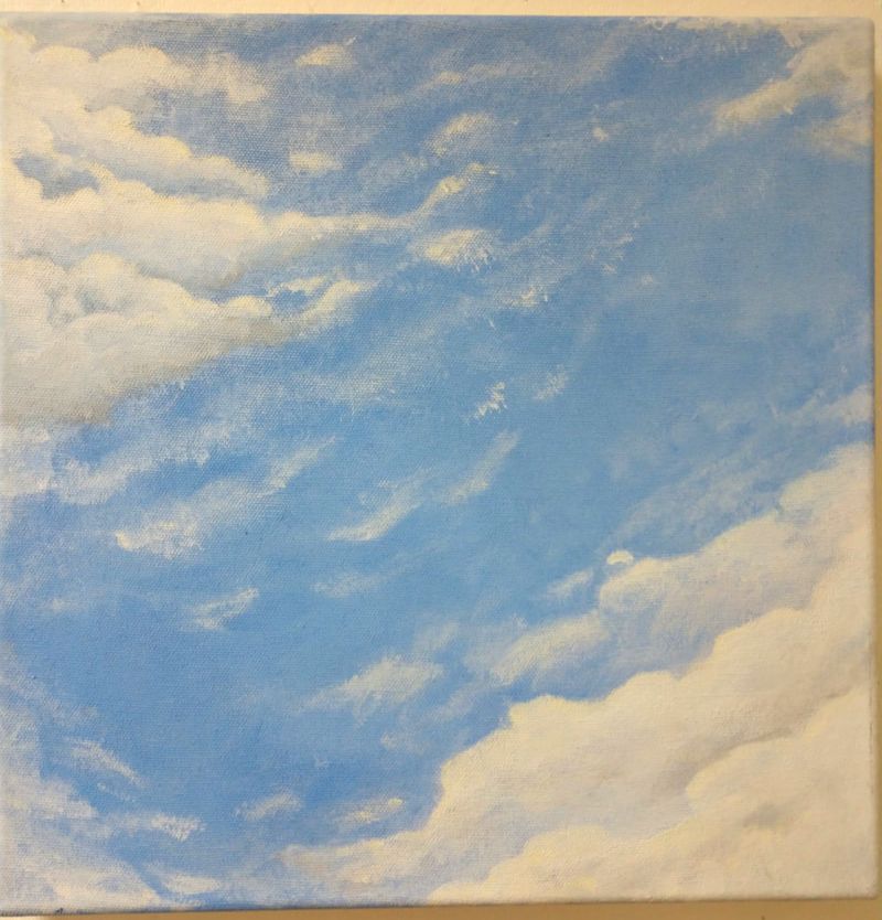
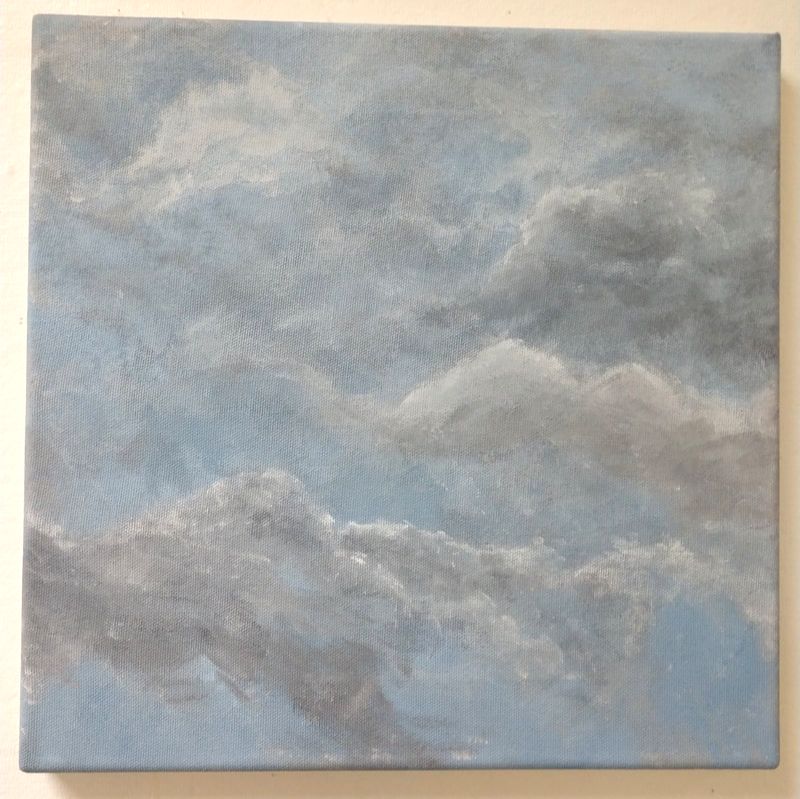
The blending style I used was new to me. I had learned it from Bob Ross, which is also where I learned the rule of applying thinner paint on top of thicker paint. These are basic painting techniques, but ones that are less required on all types of art. Some styles don't require much blending, so there's no reason to blend with a dry brush. I also found some of the paints are already too thin to dilute (in my case, the yellow was already thinner than the blues, but if it was in the background, that could cause a problem). I feel like the top one is the best one. The shading is more dramatic than the others, and you can see the brushstrokes, because I didn't blend the final layer of paint. I also like how the gradient doesn't encroach on the overall piece, nor is it too different of a shade to work. Some of the pieces that fall closer to the middle of the day had darker and lighter shades of blue, but I don't think I captured this as well. The next one down is also good, but I think I blended the final layer a bit too much, as it's harder to see the brush strokes. The shading is less dramatic than the previous one, but it fits for that scene. The light fluffy clouds look natural. If anything, I think I hadn't quite nailed the impressionistic style yet (that was the first one I had painted), and was still going for too realistic. The third one looks more like a surrealism piece to me. The clouds almost look blocky and smooth, which is something I see more in Dali paintings. There's also not enough accurate shading and blending on the lower levels, and no real outer layer that would show the brush strokes. Finally, the last canvas is my least favorite. It's based off a gloomy, windy day, and the clouds were changing completely every 5 minutes or so. I don't think the shading is too bad, but the color is very drab. It's accurate to the way the sky looked, but impressionism allows for some adaptions to the scene, to create a more dynamic painting. I also feel like I could have made my brush strokes more obvious, like in the top one, but not without darkening the shading too much. I'm still proud of this piece. It's the most accurate shading I've ever done, and my main critique is that I got a bit too carried away with that, rather than making it look impressionistic. |
|
ACT Questions1. Clearly explain how you are able to identify the cause-effect relationships between your inspiration and it’s effect on your artwork.
Monet, as an inpressionist artist, tried to paint things like you would see them if you could only see them for a second. Overall placement isn't super accurate, the shapes aren't perfect, and the images are usually a little blurry. But the colors are bold and vibrant. I tried my best too do this with my paintings. 2. What is the overall approach the author of your research has on the topic? My research on impressionism was more what I was looking for. It had common visual affects of the art movement, and common meanings and goals of the artists. The page I found (by the same creators) on Monet were more of a biography, though it did have a bit of information on his later paintings, specifically his Waterlilies series. 3. What kind of generalizations and conclusions have you discovered about people, ideas, cultures, etc. while you researched your inspiration? I think it's generally assumed that impressionists were unable to paint realistically, or that they didn't know the traditional "rules" of art. In reality, this isn't true, they simply chose not to follow them. 4. What was the central idea or theme around your inspirational research? Finding out what the more subtle visual qualities of Monet meant about his work. I knew most of his later works were cropped non-traditionally, and that he painted water lilies a lot, but I didn't know if there was any true, deeper meaning behind it, other than that he likes painting them. 5. What kind of inferences did you make while reading you research? The meaning behind Monet's Waterlilies series is mainly that he finds them beautiful, and his strange cropping is because he believed that he could display their beauty without giving the viewer any reference points to determine where they are meant to be in this location. |
Citation
|
