|
"Barrels out of Bond"
|
Inspiration
|
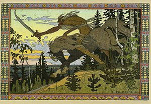
My piece is inspired by Ivan Bilibin, an illustrator and stage designer from Russia, well known for his illustrations of Russian fairy tales. His work is most well known for it's use of movement and bright but varied colors.
The movement in the pieces seems to be nearly frozen in time. Hair, feathers, plants and water spray are frozen in the air, mid-movement, and the figures and animals common in fairy tales are caught in their own movement as well. His use of color uses light, easily blended colors, but are still vibrant. As he often made fairy tales, which take place in nature, many of his prints have primary greens and blues, with most of the other color coming from the human figures and other man-made items, which usually showed traditional Russian designs, and the borders, which also showed vibrant color and decorative Between the use of color and movement, and the style used to draw the leaves and decorative border, Bilibin's illustrations are very obviously tied to the Art Nouveau movement, which uses this new, fresh aesthetic to make a functioning piece of art, that's pleasing to the eye but still completely functioning in it's original purpose. In Russia, Art Nouveau wasn't considered it's own art movement, rather a sub-genre of Модерн (Modern) art. Art always hold some characteristics of the creators culture, and Bilibin's prints do just that too. Rather than the standard intricate swirls and circular patterns, his work uses more traditional Russian patterns, with rectangular borders and more contrasting colors. Bilibin was always a strong believer that the intricate details are only meant to decorate, not distract from the main purpose. In a 1904 publication of The World of Art, he states, "The main principle… is that the detail should never drown the whole. … The decoration is only pronounced in places, like a vignette at the end of the text". |
Koshchey the Deathless by Ivan Bilibin, 1901
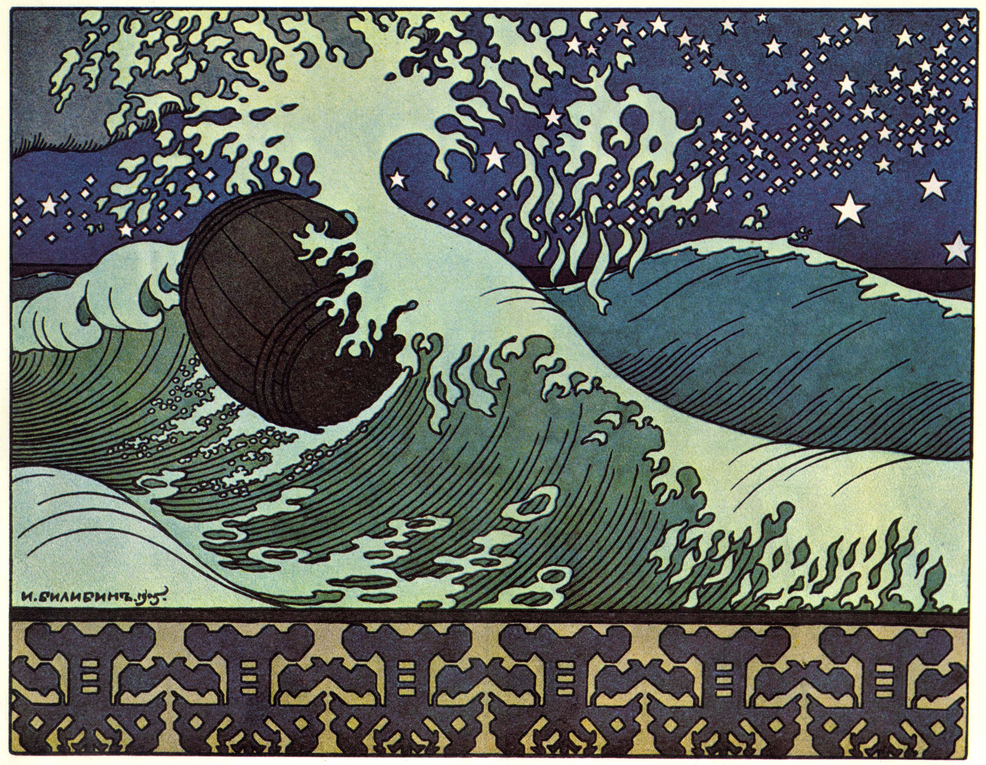
The Barrel by Ivan Bilibin, from "The Tale of Tsar Saltan", 1905
|
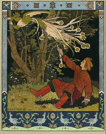
Ivan Tsarevich Catching the Firebird's Feather by Ivan Bilibin, 1899
|
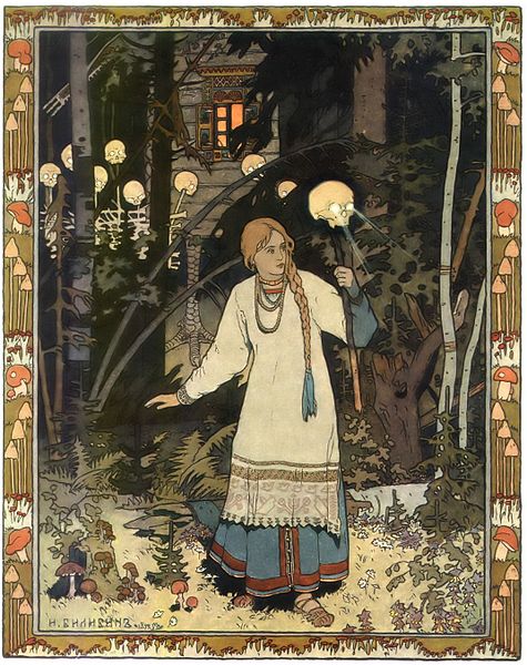
Vasilisa the Beautiful by Ivan Bilibin, 1899
|
In my illustration, I used a block print to create the line work, though unlike in my block print from last year, I used oil based ink. Bilibin uses wood prints to create the main line work, then colored it in by hand. This allowed them to be more mass-produced, but not entirely, as was common with art nouveau illustrations from the early 1900's. I colored my line work in with India Ink that I diluted down to the consistency I needed, and printed both onto multimedia paper, so it didn't wrinkle or tear from all the water.
Planning
|
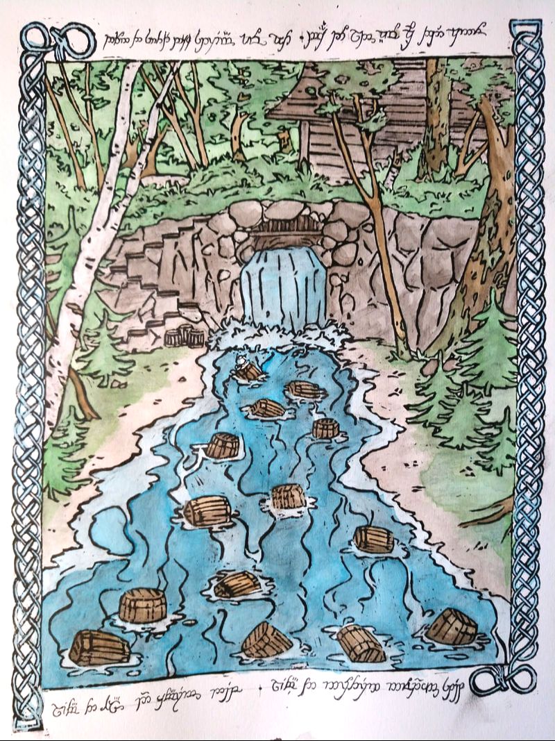
The topic I wanted to cover was hard to decide. Part of me wanted to stick to the fairy tale theme, but I wanted to illustrate a more modern story too. I chose to go with a middle ground, a literary classic with fairy tale themes: The Hobbit by J.R.R. Tolkien. It was one of the first novels I read (at age 5 with my dad's help), and I still remember parts of it extremely vividly. I then needed to decide what scene I wanted to illustrate. My mind was immediately drawn to those scenes I could remember from nearly 13 years ago, including the scene where the trolls turned to stone at the riding sun, the scene were the dwarves and Bilbo hid in barrels to escape Mirkwood, or the scene where Smeagol and Bilbo have a riddle battle. These were the scenes that I chose to sketch out for my planning sketches.
I chose to go with Barrels out of Bonds, as I liked the layout of the piece the most. Once I knew what scene I wanted, I took the time to draw out a fully detailed, to scale drawing of the line work I'd carve into the block print. For quite a while, I was worried that the line work would be too detailed for a block print. Usually, a dry point works much better for detailed and thin lines. But Ivan Bilibin's work is inspired by a mix of Japanese block prints and Russian art nouveau. As I'll explain in the process section, I did some experimenting to see if I could get enough detail in the block print, which worked well enough. I decided to go through with the block print, and touch up any part that didn't come through dark enough with a calligraphy pen and the block printing ink.
|
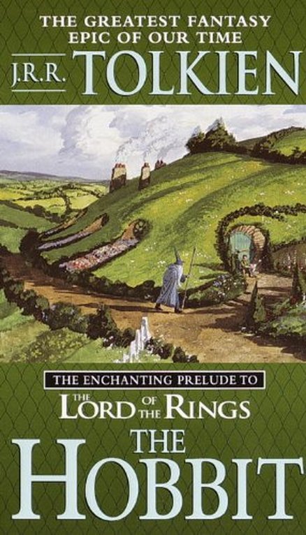
The copy of The Hobbit I own, which I've read twice, once when I was about 5 with my dad, and again a few years ago.
|
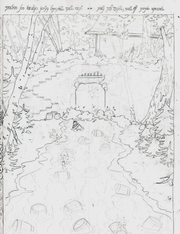
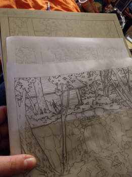
My detailed line work sketch. This image was drawn without flipping it, meaning I needed to trace it on tracing paper.
|
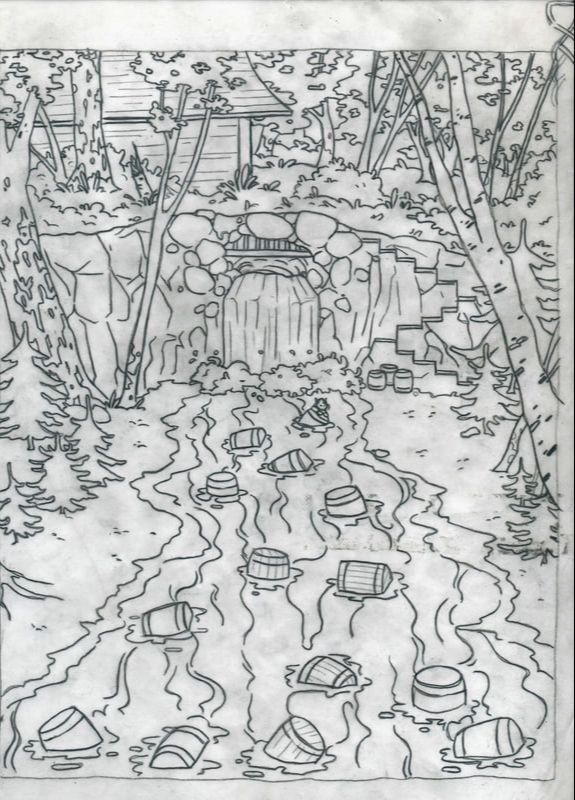
The flipped image, made by tracing the image with tracing paper, then flipping the paper. Using a scrap of printer paper with graphite on it, I transferred the lines to the block of linoleum.
|
Experimentation
|
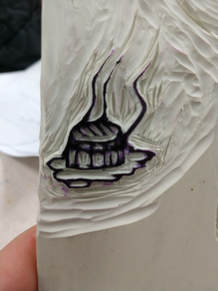
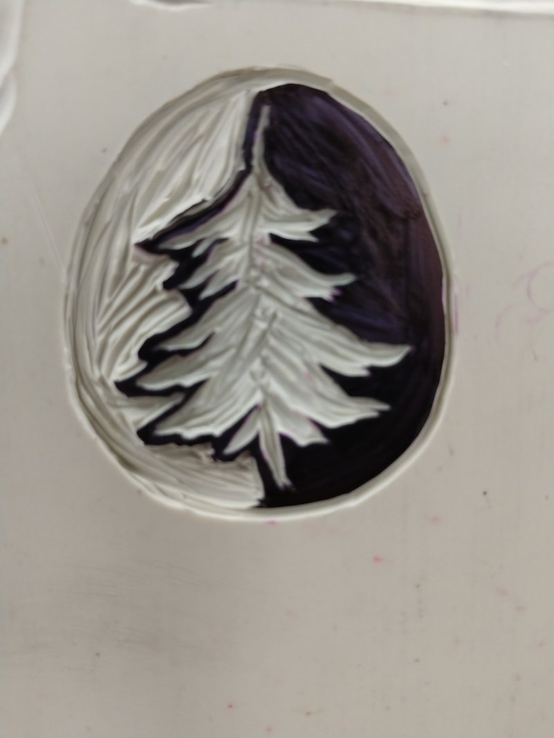
I did some experimenting with my tools and linoleum blocks. I was worried the block print would be way too complicated, and I wouldn't be able to make all the fine lines. I used a smaller piece of linoleum from an earlier attempt at a project, which I redrew a to-scale drawing of one of the barrels, and carved it out to practice the fine lines. I was surprised this worked so well. I also tried carving one of the trees, which also worked great. If I couldn't get all the detail I wanted, I would have needed to buy a piece of Plexiglas that was big enough, and do a dry point, instead of a block print.
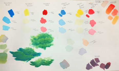
As for the ink wash, there were a few different types of ink in our art room. I tried them at different amounts of water added to it, so I could see how opaque they are. I made a small chart, so I could compare them, and did a bit of practice blending the colors as well. 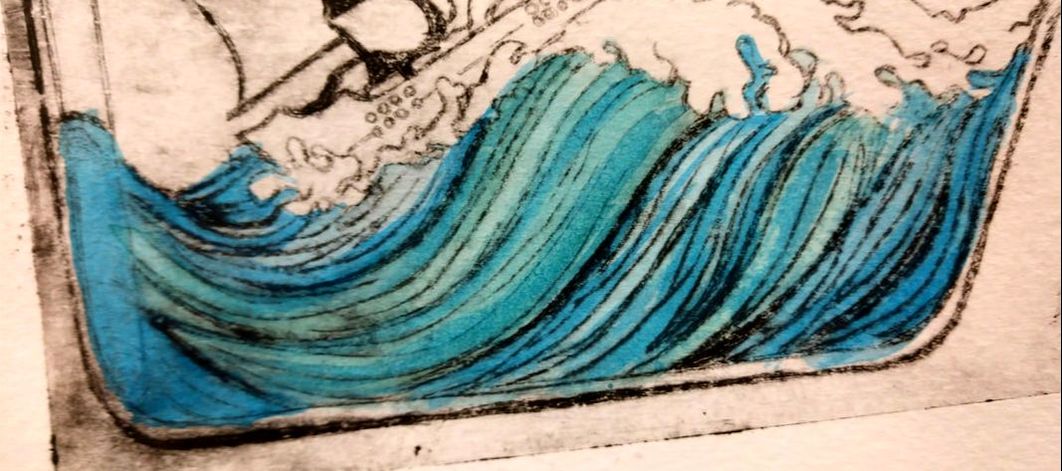
|
|
Process
|
--Transferring to Block--
The creation of the full-sized sketch was the first important step, as I needed that to flip the image and transfer it onto the linoleum block. I simply traced the line work to using 9" x 11" tracing paper. By flipping the sheet over, I flipped the image. Using pencils, I rubbed graphite onto the back of a sheet of printer paper, because it's thinner and I won't need to press as hard to transfer the graphite than I would need to if I used the thicker sketch paper I had in 9" x 11" sizes. I used the flipped side of the tracing paper, and traced the line work again, to transfer the image through to the linoleum print. I would stop periodically, to trace the blurry graphite lines with a permanent marker, so it wouldn't blur and smear to the point where I couldn't see what I was doing anymore, which was a problem I had a lot while making my block print from last year. Once the image was properly transferred, and traced so it wouldn't rub off right away, I was ready to start carving. |
|
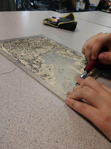
--Carving--
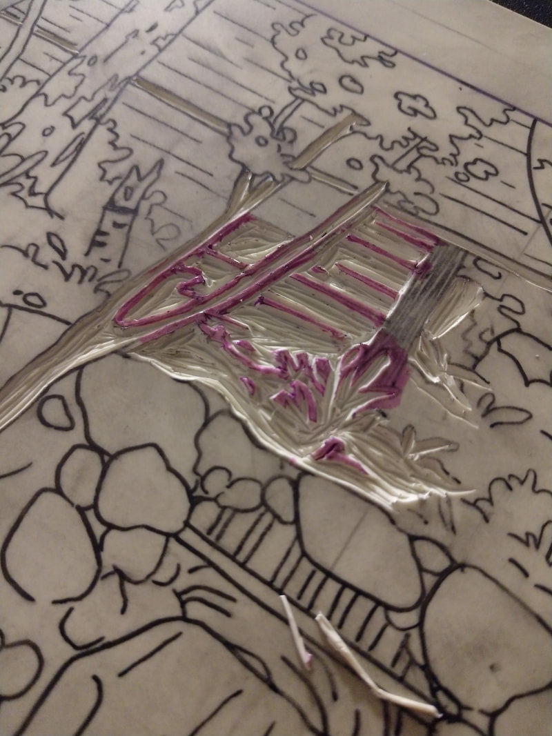
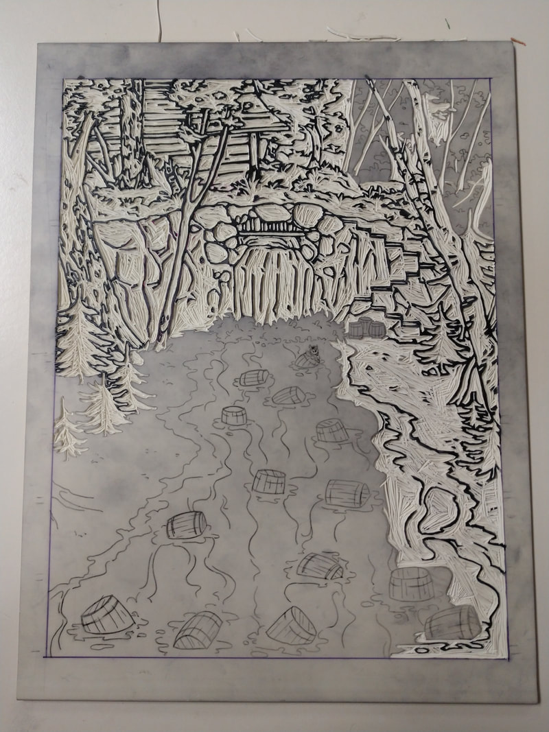
Once the flipped image was completely transferred to the block of linoleum, and traced to it wouldn't fade too quickly, I could start carving the block print. I very, very, carefully carved around the line work doing my best to leave solid lines. I carved with both hands on the tool, one pushing the piece and the other on the blade, to carefully direct the cut. Carving the block took a very long time, and I worked on it where ever I could. First I Carved out the main section, starting at the top and working my way down. I skipped some of the barrels, leaving them for last, then went back to carve them out once I was done with the main illustration. I practiced drawing some Celtic borders on sketch paper, so I would know how hard different patterns were to draw, and which ones looked best. Rather than transfer the images directly, I free-handed the basic pattern with a pencil, then traced that with a pen to mark with lines weave over others, and which go under. Carving these took a while, because there are so many small patches between the lines that I needed to very carefully carve away without ruining the intricate designs. Once I finished the border, I just needed to cut away the large blank spots that I would write the elvish script onto later. |
|
|
|
--Printing--
|
The printing process was nearly identical to the block print I did junior year. The only difference was the type of ink and paper I used.
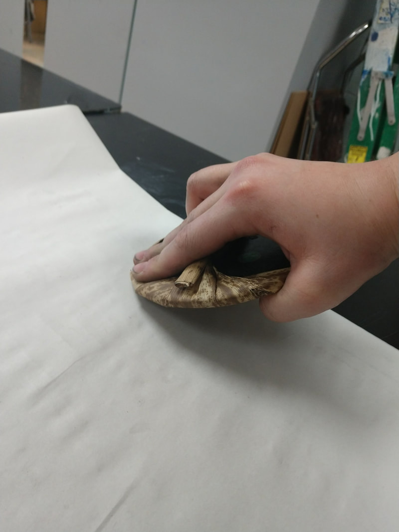
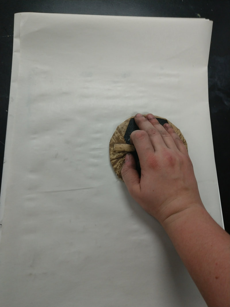
The tools I used were: -traditional bamboo baren -Speedball brayer -cookie tray -paint knife -various mixed media and watercolor papers -large news print paper -oil based ink -mineral spirits (for cleanup) I started by scooping some ink onto the cookie tray using the knife, and spreading it out into an even layer with the brayer, a tool similar to a rubber paint roller. I would also fold 2 sheets of news print into halves, and lay the linoleum slab carved-side-up on it. Using the brayer, I'd evenly coat the carving. I'd then move the slab to the inside of newsprint, and slip the top half into the fold of the second sheet. This was so the part that got ink on it won't be on the table, on the part I'm rubbing with the baren, or touching the paper at any point. If using some of the smaller sheets of paper, which were the same size as the block of linoleum, I needed to be very careful about lining the sheet up right, but the larger watercolor sheets were big enough that I could crop it down if need be. I'd press the paper firmly into place, then close the newsprint over it. Using the baren as seen in the second figure to the right, with the baren flat on the paper, I'd rub fairly hard across the entire piece. Once I had done that for a few minutes, I'd shift my hold so I was pressing down with the edge of the baren, which applies harder pressure in a more fine point. This let me make sure I'd gotten every part. I'd do this for a few more minutes. After about 10 minutes total, I'd open up the newsprint and carefully pull the paper off, and set it aside for the drying rack. In the end, I made about 10 copies, some on sketch paper, some on multimedia paper, and some on watercolor paper. |
|
--Coloring--
Before adding the ink, I needed to let the ink dry a bit. This was my main mistake I felt I made. Because oil ink takes a few days to dry at the best of times, I was worried it would take too long to dry. After waiting two days, I took one of my misprints and checked to see if it dried. It smudged when I touched it, but I tried painting in some ink, and it didn't disturb the ink too much. As long as I was careful while writing in the elvish script and painting to not rest my arm on it, it should be fine.
To color this. I diluted ink with water, and used a paintbrush to color large patches at once. The colors were meant to be vivid, but not intricate. Most of the outlines were filled in with solid color, with little shading. The paper I was using is very think, so I didn't need to worry about tearing the paper up when I layered the colors.
Reflection
Overall, I'm very happy with how this one turned out. My only critique is that I didn't time things out quite right. I spent too long on the carving process, and didn't have long enough to wait for the ink to dry before coloring it. Had I known before hand, I would have used some quick-drying medium in the ink, so my prints would be dry within a few days, rather than a few weeks. The oil inks didn't blur too much, far less than the water soluble ones did when I tested it out, but they did darken the ink washes a bit. Because the colors are still so vibrant, I don't think it's too noticeable.
Balancing my time a bit better would probably have helped, as I was a bit behind on this project, but I'm honestly very proud of how this turned out. I think the time was well spent. It would have been fine if I didn't have so many other classes also preparing for exams at the same time.
Balancing my time a bit better would probably have helped, as I was a bit behind on this project, but I'm honestly very proud of how this turned out. I think the time was well spent. It would have been fine if I didn't have so many other classes also preparing for exams at the same time.
ACT |
Bibliography |
|
1. Clearly explain how you are able to identify the cause-effect relationships between your inspiration and it’s effect on your artwork.
Bilibin was best known for his water color illustrations, which were block prints with gouache. He illustrated children's stories and Russian fairy tales. I chose to use the same style and mediums to illustrate a story from my childhood. 2. What is the overall approach the author of your research has on the topic? They're more like a biography than I really needed, but there was definitely some good information on his meaning and beliefs about art. 3. What kind of generalizations and conclusions have you discovered about people, ideas, cultures, etc. while you researched your inspiration? Because of the wording on some of my resources on Bilibin, I had to draw some conclusions on whether or not his illustrations were actually block prints, or if they were traced, or transferred by hand. A few different sites sayed he was "inspired by Japanese block prints", but I couldn't quite figure out if that meant they were block prints too. 4. What was the central idea or theme around your inspirational research? I was trying to find out exactly what mediums he used, which I found harder than usual. Most sources I found were too much like a bibliography, so most of the information wasn't of much use to me. 5. What kind of inferences did you make while reading you research? Despite the movement usually being tied to France, Ivan Bilibin was an Art Nouveau artist. His works fall around the right time period, and share many visual qualities, meanings and beliefs. |
|
