|
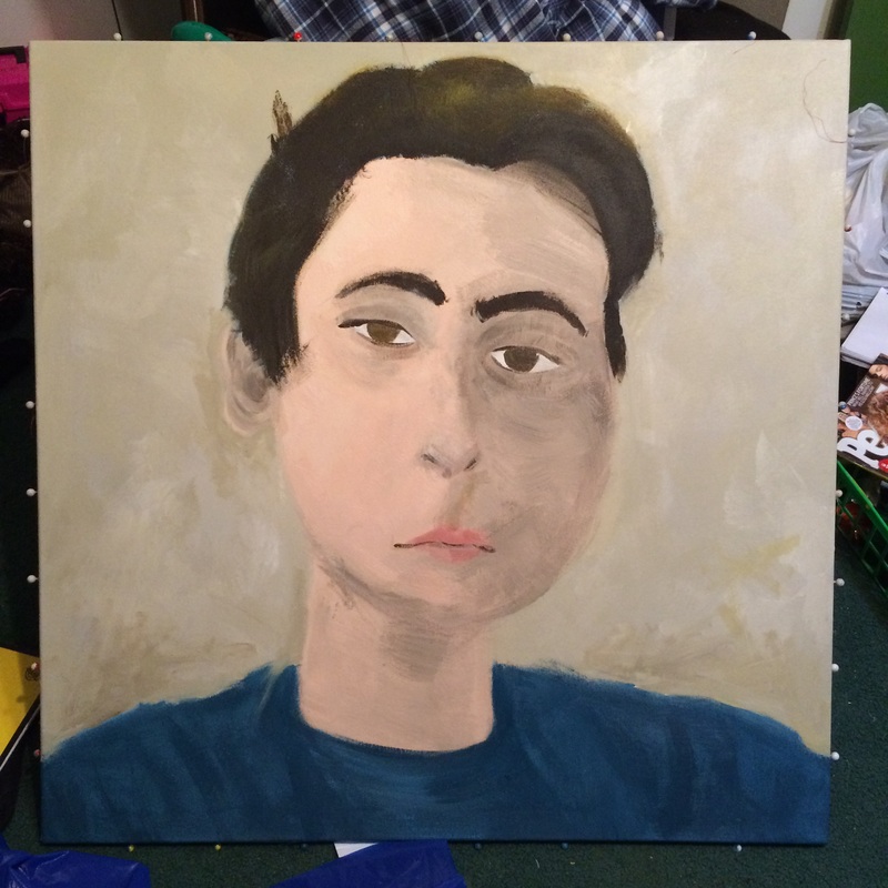
(Self) Portrait of Jake
1meter x 1meter Acrylic on Canvas November and December, 2016 My self portrait is based of the works of Catherline Graffam, a trans-woman who is very active in the online LGBT community. I based my work on her series called “Identity Online”, which uses soft, blurry shapes and lines to give the paintings a feeling of unrealness, showing how are online persona doesn’t always line up with the one we use in real life. I tried to emulate this in my portrait.
My self portrait is acrylic on canvas, which was a bit of a problem giving the blurred effect I was looking for. I feel like using oil paints would have been more effective. The size of the paintings are also much smaller in “Identity Online”, which made the accurate way she paints much easier. Stretching a form to a 3 foot by 3 foot canvas made the proportions stretch. |
Planning
Brainstorming |
|
|
I wanted to do something that wasn't hyper-realistic, because this was my first self portrait, and my first time painting something so large. I originally wanted to do something in Expressionist or Post Expressionist styles, but, unfortunately, I lack the beautiful facial hair that is usually used to show movement in the paintings, and decided to do something else. While looking up other painters who did portraits, I found Catherline Graffam, who is a transgender artist. I really liked the style she used, and, despite my wish to avoid realistic styles, I found myself using her work as inspiration.
|
Artist Inspiration
|
Catherline Graffam is a trans-woman from New Hampshire, who is quite actively involved in the online LGBT community. I used the pieces from her exhibit "Identity Online" as the stylistic inspiration for my portrait. I tried to emulate the soft, blury edges used to show how there identity online isn't straight forward or easy to read. The pieces are fairly realistic, except for the blurry edges, and this would prove to be a problem when I was painting.
Her painting style seems to be mainly done on smaller canvases, which may be a problem when it comes to blowing this up onto a meter^2 canvas. |
|
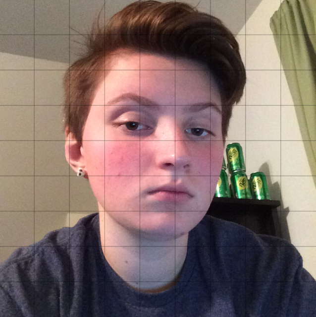
Planning Sketch
|
Instead of a planning sketch, I photoshoped a grid over a square picture I took. It gave me a much more acurate image than a sketch would have, and the colors would be much more acurate. I would need this grid to draw the image once I had the background done.
|
|
Process
Creating the Canvas
Stretching my own canvas only took about 30 minutes, and was very easy when the stretchers were already made. The first thing i did was slip the corners of the stretchers together and stapled the sides together at the corners to make the wooden frame that the canvas would be stretched over. Next, I layed the bolt of canvas on the floor and cut out the piece I would need, about 4 feet squared, and centered the frame over it. I folded one side up to it as lush against the frame, then use the staple gun to staple the edge down, leaving the corner loose for the time being. Then I stapled up the opposite side, and did the same on the other 2 sides. For the corners, I pulled the flap up to form a triangle, then folded it in half to make a triangle that was completely hid behind the frame, then stapled them down. Lastly, I cut off all of the excess material, so it wouldn't bunch up.
Actually stretching the canvas took quite a bit longer. I coated the entire canvas with gesso, which I leaned took quite a bit more gesso than I thought I would need, with 2 layers, and I needed to let them dry in-between. There really isn't much to say about this, It was basiclyjust painting the entire thing white, but as the gesso dried, it shrank, stretching the canvas so it was tight against the frame. After the gesso dried, I took it home to start painting over Thanksgiving brake.
Actually stretching the canvas took quite a bit longer. I coated the entire canvas with gesso, which I leaned took quite a bit more gesso than I thought I would need, with 2 layers, and I needed to let them dry in-between. There really isn't much to say about this, It was basiclyjust painting the entire thing white, but as the gesso dried, it shrank, stretching the canvas so it was tight against the frame. After the gesso dried, I took it home to start painting over Thanksgiving brake.
Painting
The first thing I did was paint a light blue background, which honestly wasn't the right color at all, and I later decided I would need to change it. But for the time being, I used that as the backgroun. I then hammered thumb tacks into the side and strung thread up to make a grid that didn't ruin my background. Then, using the photoshoped image, I drew the outline of the main areas, and began painting the main form. For the entire piece, I used light strokes with a lot of paint loaded on each stroke. I made a tub of flesh tone at school and used that to make all the rest of my skin tones. Around half way through, I decided to change the background color, because the photos I based my self portrait off of used a lot of mute, dull colors. I chose to use a sandy brown color.
Reflection
Color was one of the biggest issues, as well as shading and lining the eyes up, as well as every other step while making a self portrait. I hate shading, and I especially hate shading people.
ACT Questions
1. Clearly explain how you are able to identify the cause-effect relationships between your inspiration and its effects upon your work.
The lighting style of my piece mimics that of Kelly's, while the paintings I used to plan my sketch have similar scenes of balance and
2.What is the overall approach the author has regarding on the topic of your inspiration?
All of the information on my artist was from her own website, so it was meant to paint her in the best light, so more people would buy her works.
3.What kind of generalizations and conclusions have you discovered about people, ideas, cultures, ect. while you researched your inspiration?
Nature and children seem to be common themes in block prints. Between Martha Kelly, who did a lot of prints on natural landscapes, a gallery section on natural parks, and a series of illustrations on girlhood, and the themes people in my class chose, it seemed that there was a lot of people focused on themes of nature and/or childhood.
4. What was the central idea or theme of around your inspirational research?
The obvious theme is ships in storms. All of my inspirational research was on resonance paintings, because that was a more common theme in that era, than in german expressionism, and because these paintings are great at showing movement, even in water, which I've found can be very hard to do. I wanted to imitate these themes in a different style, which is more common i block print.
5. What kind of inferences did you make while reading your research?
