
"Mon Jardin"
3'x 2' (2' x 1' per panel)
Acrylic on Canvas
Date: January 2017
Exhibition Text:
Every year, I have a garden, where I grow vegetables and fruit, and flowers in pots around the outside of my house. This garden has always been a big part of my life. I've had a garden every year since I was 5, and I enjoy being able to look outside and see something that I planted grow. I feel like being able to plant something, and seeing my environment change is a way of judging how much of an effect I'm having on the area around me. My triptych is meant to capture the feelings I've always felt toward my garden, using art nouveau inspired painting styles.
|
|
Sketches
I planned out each panel separately, and using an eraser to make the proportion equal, because I didn't have a ruler. The sides just needed to be 1 by 2, so I used the side of the eraser as a unit to measure out the panel. The sketches includes side sketches that goes into detail on the flowers, so I can paint them easier. The I planned out where the brackets would sit and what decorations would be used in them and around the halo. |
Artist Inspiration
My Triptych is based off the art nouveau movement, specifically the paintings by Luis Comfort Tiffany for his fathers company, Tiffany and Co. His paintings used feminine women in lose fitting dresses and an abundance of flowers on a solid color background to give the image a majestic, almost fairy-tail like appearance. The colors can range anywhere from light pinks to dark greens or browns, and the flowers can either contrast or compliment the background. The style of architecture that the paintings are based on is seen in the highly ornate backgrounds and decorative, winding borders and brackets.
My Triptych is based off the art nouveau movement, specifically the paintings by Luis Comfort Tiffany for his fathers company, Tiffany and Co. His paintings used feminine women in lose fitting dresses and an abundance of flowers on a solid color background to give the image a majestic, almost fairy-tail like appearance. The colors can range anywhere from light pinks to dark greens or browns, and the flowers can either contrast or compliment the background. The style of architecture that the paintings are based on is seen in the highly ornate backgrounds and decorative, winding borders and brackets.

|

|

|
|
This style of painting usually has a relatively simplistic color scheme, usually with analogous color schemes with slight variants when other colors are needed. The use of flowers and long, flowing dresses to emphasize the femininity of the girls that take center stage, as well as the soft colors contradict the semi-stylized painting style and bold outlines. Many modern artists use a similar style to create a softer type of feeling within their art, and this style is still largely popular today (although it's name is still hard to spell).
To the left are some examples of more art nouveau inspired pieces, some genuine, and some not. |
|
Brain Storming
I knew what I wanted to do with this project right away. Triptychs are easily associated with art nouveau, because they often use multiple vertical panels, like our triptychs do. As seen above in the middle picture, the panels are fairly narrow.
The theme of my garden was quick to come to mind, once I decided to use art nuoveau as my art style. Various types of Flora is used in art nouveau, which enhances the ideas of femininity used in most art nouveau painting, and contradicts the use of them in industrial marketing, and their semi-stylized painting style and outlines.
I wound up using the idea for different color schemes for each panel after I wound up not being able to recreate the right shade of brown. Although this wasn't originally intended, it was something I thought about doing from the beginning, and shot down because it seemed like it would require more changes to my original planning sketches.
Process
Making the Canvases
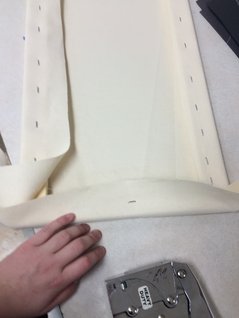
Using three canvases means having to stretch and gesso three 1 foot by 2 foot canvases. I made these using pre-made stretchers. I stapled all of the canvases in one sitting, and my hands felt like they were falling off by the end of the block. I gessoed one of the panels before the others, so I could get a head start on painting at home.
This process was no different than with the 3 foot by 3 foot self portrait from first semester, there was just a lot more stapling to do. instead of stapling about 12 feet around the canvas, I needed to staple about 18 feet. It took a class period on its own, and my arm was sore for a week after.
Because one of my friends has tiny little hands, I also helped her staple her canvases, because her hands were to teeny tiny to use the staple gun efficiently, and it was taking her all class to finish one canvas. <3 Carolyn
Painting the First Panel
I started painting the one panel I had completely planned out, which lead to some complications later. I used a maroon colored pencil to draw the basic forms, so it would be less likely to show through the paints. Then I painted the background a muddy brown color, and added the darker brown brackets to the top two corners. The circle that sits in between the brackets was then painted a yellow gradient, getting lighter as it moves further out. There was also a border around the circle that I painted black, and used white paint to make moons, to add to the solar theme I was trying to incorporate into my piece. Once the background was finished, I started to paint the body. To save on paint, I added some white to the skin-tone from my self portrait, which worked for this painting too. For this entire painting, I tried to use smooth strokes with a lot of paint on the brush, to avoid thin layers that didn't cover the layer of paint under it. I then painted the purple cone-flowers. To give the plants a feeling of depth, I used a darker green to paint a general background, and a lighter green for the stems in the front. Then, using a very dark brown, I painted the heads of the flowers, and grey to make it look like it had the spike seed packets that the real flower has. I then tried to mix up a purple color, which took far longer than I would have liked, and painted the petals.
The last step of painting each panel is the outlining. To get thinner paint, I would add a very small amount of water to my black paint, and a bit of brown to that. This not only gives me thinner paint, it also adds a bit of brown, keeping the lines from being to contrasting, and keeping the painting as a whole soft.

|

|

|
Painting the Second Panel
This panel doesn't have a person on it, just a skeleton, which meant i didn't need to use any skin tone. Unfortunately for me, I ran out of brown paint, and the store I went to didn't have any of the same shade in stock. I picked up a different brand of burn umber, meaning I needed to try and make the same color, using a completely different base color. The backgrounds were meant to be the same in all of the panels, but the background for the middle panel was much darker and had less red in it than in the next one. I used the same techniques to paint this panel as I did the one before it. To make this seem like more of a conscience effort, I used a color scheme that had more red and oranges in it.
The yellow paint I had at home wasn't opaque enough to completely cover the dark background and light bones evenly, so I used my white paint, which is much thicker, to do a background, and before it completely dried, I used a flat brush to stipple oranges, yellows and reds to make an uneven coating of colors. To finish off the panel, I used black to make the outlines, which made the marigolds actually resemble flowers.

|

|

|
Painting the Third Panel
The third panel was when I feel this project really started to fall apart. I had a sketch of what I wanted to do, but I wasn't pleased with how the boy as posed. Do to timing, I just had to make do. I started painting even though I wasn't satisfied with the layout.
The blue sun in the background is meant to by a blue giant. They're lighter blues, but they aren't quite the color I made. To keep the color scheme, I wanted to get some blue flowers in their, but the blue was so bright, no flowers really worked. I put off doing it for a while, and wound up just making the kids shirt the same color to tie it together somehow. This left the background awkwardly blank on the one side.
If their was one project I would redo over the summer, it'd probably be this one. I don't like how it looks, the pose and the face arn't right, and the color scheme isn't right, but I feel like I would only need to completely redo this one panel. The middle one looks the best, and it's also the most filled with flowers, and has an interesting background "halo" with the sun and moons around it. I think just adding plants to the background of the right panel would be enough to fix it, but I don't think I can save the left panel without completely painting over the panel and starting from scratch.

|

|
