
|
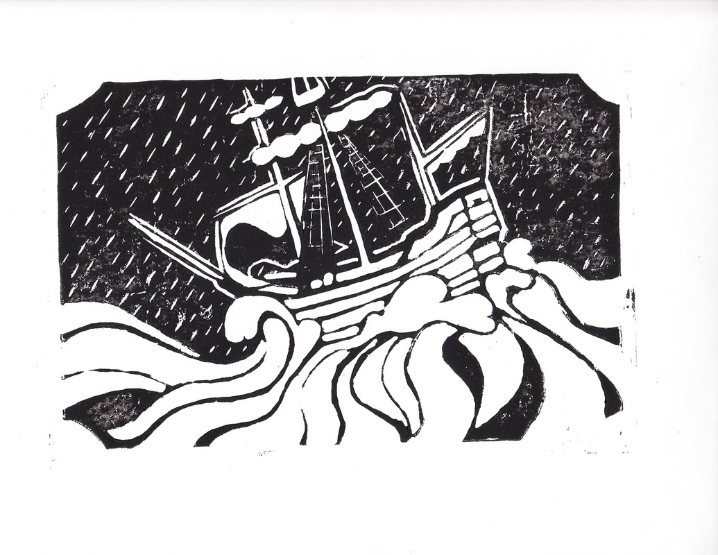
"At Sea in a Storm"
Size: 22.5 cm x 14.5 cm Medium: Linoleum Block Print Date: September- October, 2016 Exhibition Text: My goal was to imitate the themes of German Expressionism pieces, using high contrast shading where there was any. Most of the piece seems unnaturally lighted, as the ocean and boat are both light, while the sky in the background pure black, except for the rain. The lines are also smooth, and curved, and placed very precisely to avoid having "sketchy" lines, which is more common in German Expressionism. |
Planning
Brainstorming
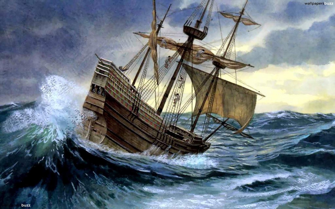
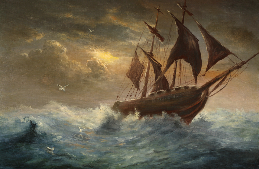
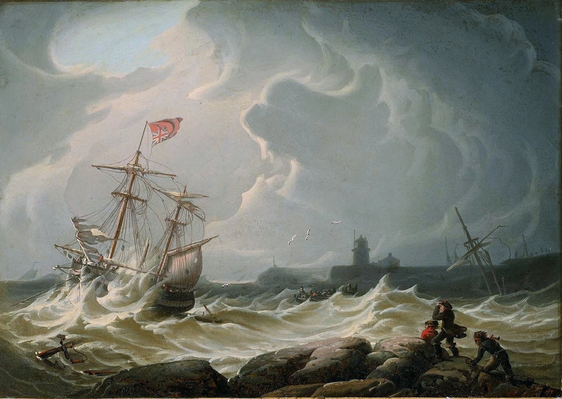
I wanted to do a nautical theme for my block print and drypoint prints, because I knew my grandfather likes naval boats and ships, and i wanted to make a present for him.
I used many romanticism paintings as reference images, for how a ship looks with strong winds and large waves affecting it.
I used many romanticism paintings as reference images, for how a ship looks with strong winds and large waves affecting it.
- some of the sails are taken down, so the wind doesn't pull them off coarse
- the boat is lifted by the waves, rocking it, or pushed over until staying on the deck would be impossible.
https://inventandinnovateblog.wordpress.com/2016/02/03/crusoe-the-jonah-caught-in-stormy-weather/Last editedFeb. 3, 2016,Daughter of Liberty, Accessed Oct. 2 2016
对不起, 我要去做外汇交易了, 别再找我了. | Vantage FX万致官网,
Web. 30 Sept. 2016
"Robert Salmon: Ship in Storm." WikiMedia Commons. Wikimedia, n.d. Web. 30 Sept. 2016.
对不起, 我要去做外汇交易了, 别再找我了. | Vantage FX万致官网,
Web. 30 Sept. 2016
"Robert Salmon: Ship in Storm." WikiMedia Commons. Wikimedia, n.d. Web. 30 Sept. 2016.
Planning Sketch
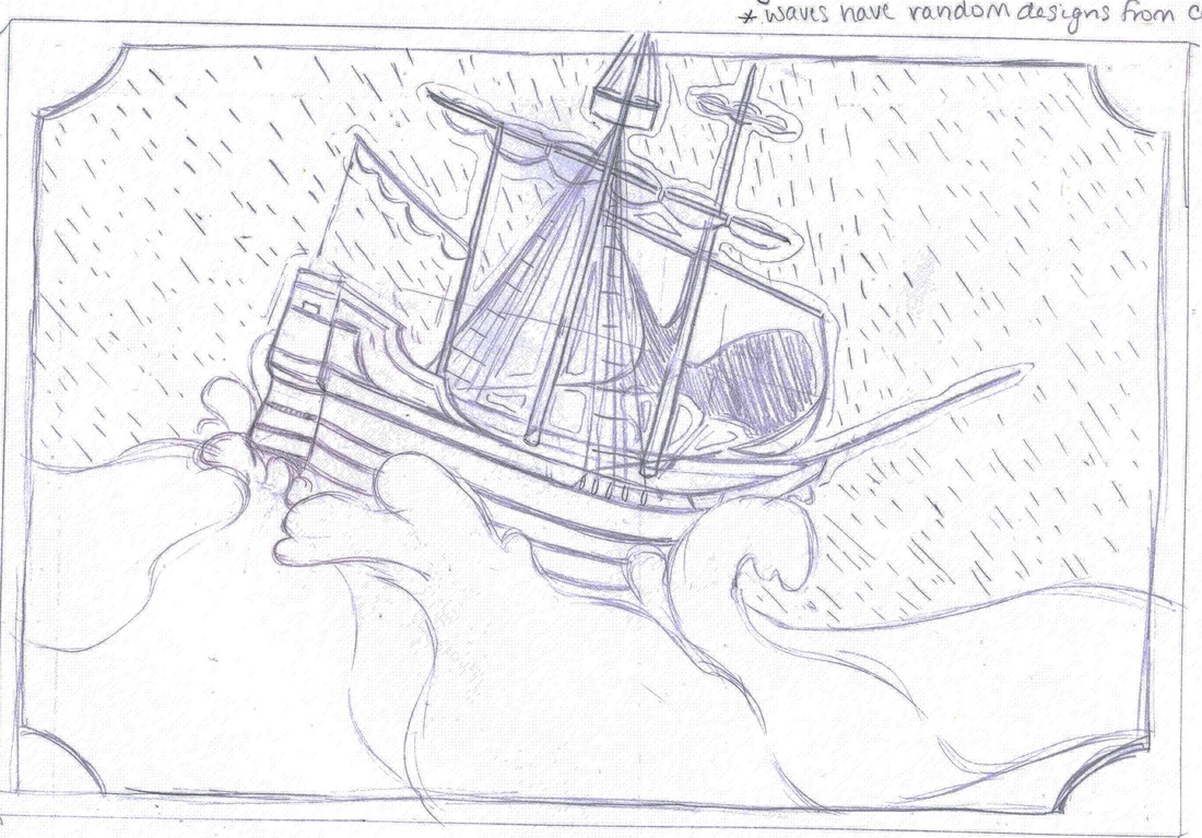
I knew how i wanted the plate laid out; I wanted the waves to take up about half of the plate, and the boat to take up the other half vertically, with a dark background. I sketched this up, and decided to have a white border around the edge, to frame the piece nicely.
The sketch didn't change much; I liked the layout and there wasn't much to change. The only change really made was extra definition in the waves, all the rain goes in the same direction and the sky needed to be inverted, so the sky would be dark.
Artist Inspirations
|
|
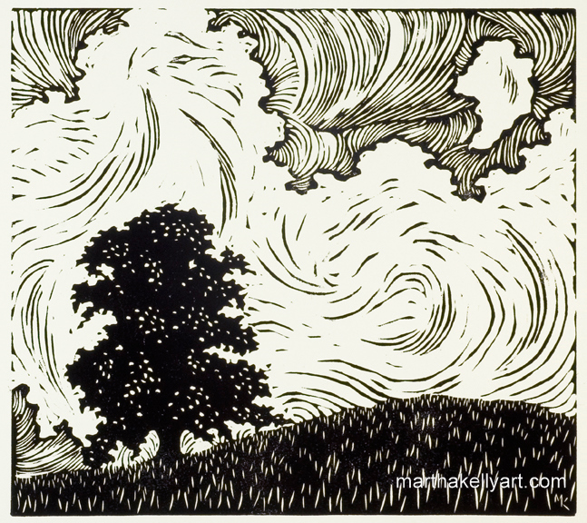
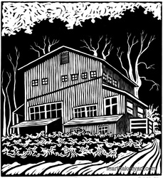
Kelly, M. Landscapes. Retrieved October 22, 2016, from Martha Kelly Art, http://www.marthakellyart.com/landscapes.html
My artist inspiration was Martha Kelly, who's done a lot of block prints, from figures to landscapes. She is from Memphis Tennessee, and has been doing block prints sense 1991. She also does water color, oil and sketches, all on her website. I personally prefer the look of a print layered over water paints, and although she does these prints, I chose to make a black and white image.
The two prints of Martha's I chose to use as inspiration are "Big Sky" and "Country Workshop", both black and white linoleum prints of landscapes. Both use unnatural lighting, with very light backgrounds, and very dark trees. The workshop in the left building is also light, despite the trees blocking the light. Although it wasn't meant to completely mimic this lighting style, it can be hard to avoid when you don't have a lot of practice shading.
The two prints of Martha's I chose to use as inspiration are "Big Sky" and "Country Workshop", both black and white linoleum prints of landscapes. Both use unnatural lighting, with very light backgrounds, and very dark trees. The workshop in the left building is also light, despite the trees blocking the light. Although it wasn't meant to completely mimic this lighting style, it can be hard to avoid when you don't have a lot of practice shading.
Process
Carving
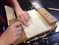
Before I could begin carving, I needed to find a way to transfer the image from my sketch book to the linoleum block. To do this, i scanned my image so I would have a back up if I needed it, and used scissors to cut the main shapes out. I then traced them onto the linoleum block, so I would have guidelines to follow while carving.
Every time we started carving, we used a table-top block to hold the linoleum block still, so we wouldn't be trying to carve one handed, and hold it with the other. I tried to carve without it for a while and found it was extremely hard. Mr. Chad made the blocks, using wood. One lip catches on the desk, and the other holds the plate, to stop it from slipping.
One thing I learned very quickly, was that graphite didn't stay on linoleum well. After about a hour of carving, the graphite was smeared all over, and I had to trace back over the lines at least 3 times throughout the week I worked on this block print. Next time i do a block print, I'm going to trace over my lines in fine Sharpie, so i don't need to worry about it smearing and fading so much.
The actual carving process wasn't to bad. I only stabbed myself a few times (*pause for laughter*). Most of the carving tools at Reagan are "pencil grip", meaning the handle sticks straight up from the blade, and are rather sharp, but their was one tool i tried to get everyday, which had a "mushroom grip", and was much duller. Despite being duller than the other tools, I found i preferred this one because i didn't feel like I was going to hurt myself, and it was still good enough to cut the linoleum without any problem. Personally, I found holding a mushroom handled tool to be much easier on my wrists and fingers, as most of the pressure was from my palm, and my wrist wasn't bent in a weird angle to accommodate the tool. Other than the handles, there where a few types of blades as well. About half were corner blades, shaped like a right angle, and half were U blades. I preferred the U blades, because no matter how hard I pressed down, I didn't need to worry about how thick my lines were. With corner blades, pressing harder will make a wider line, but U blades are about the same thickness, regardless of how hard you press.
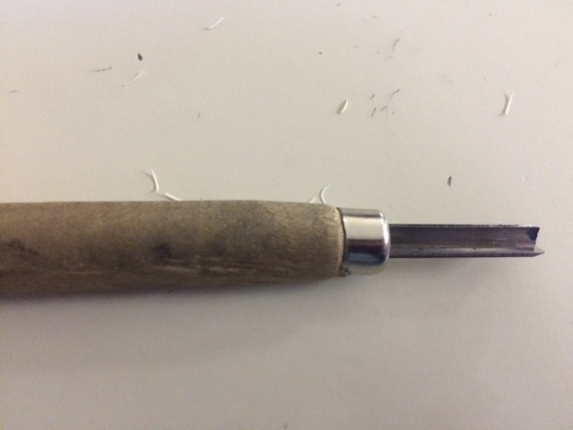
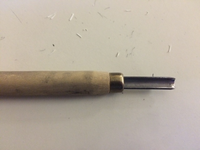
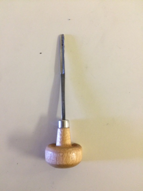
From left to right: a pencil grip corner tool, a pencil grip U tool, and a mushroom grip U tool
The carving process went without a hitch, it just took a while, and I had to come in on a few study halls to work on carving it. I had a harder time getting a print of it that I really liked. The only part of carving I had was pressing so hard, i made a hole clean through the plate. This didn't effect the outcome, as my plate was mostly black, but if there was a lot to carve, the plate would be weaker, and I would have to be more careful so it wouldn't fall apart or rip.
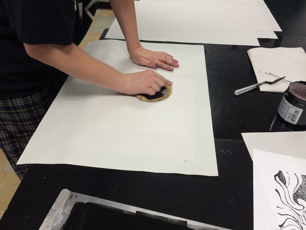
Printing
|
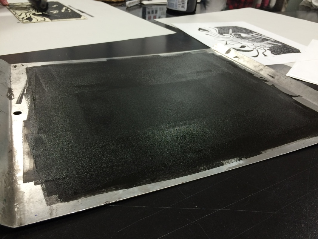
To print, we used traditional methods, using corn husk barens and rubber brayers to transfer the image. For the printing process, we used:
Once everything is evenly coated, carefully pickup the plate without disturbing the ink, and lay it on a new piece of newsprint. Carefully center the sketch paper and set it on the block, but once it's placed, don't pick it up again. It will smear. Place the last piece of newsprint over the sketch paper, making a block print sandwich. This will protect the back of the print from anything on the baren, and stop it from wrinkling or tearing the important paper underneath. Hold the baren by the handle, apply downward pressure, and move it about the paper, for about 3-5 minutes. You can go longer if you feel you might have missed somewhere, but at this point you've probably gotten everything as well as you will. Remove the top piece of newsprint and peel the sketching paper up. |
|
Reflection
As far as planning and design wise, I would clean up the waves, so they look more like waves. The top crests of the waves were meant to be white, while the main part of the waves would have more lines through it to make it appear darker. I thought it would be easy enough to plan on the fly, so I didn't include it in my sketch. Looking back on it, I think it would be much easier to make the waves look clean, with lines that go in the right directions if I took the time to plan out my exact lines to carve, instead of leaving it for later.
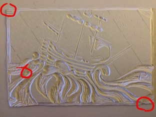
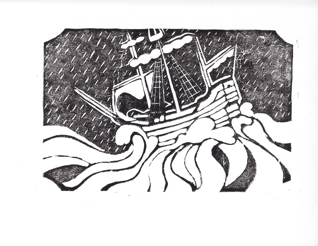
Example of a Good Print:
|
Example of a Bad Print:
|
ACT Questions
1. Clearly explain how you are able to identify the cause-effect relationships between your inspiration and its effects upon your work.
The solid black and white with strange, unnatural lighting was meant to mimic Kelly's black and white blockprints, and the actual layout of the image was meant to mimic the movement of romantic style paintings, which oftain focused on ships.
2.What is the overall approach the author has regarding on the topic of your inspiration?
All of the information on my artist was from her own website, so it was ment to premote her work. It looks very professional, and mainly focusses on her art pieces, not on her as a person.
3.What kind of generalizations and conclusions have you discovered about people, ideas, cultures, ect. while you researched your inspiration?
Nature and children seem to be common themes in block prints. Between Martha Kelly, who did a lot of prints on natural landscapes, a gallery section on natural parks, and a series of illustrations on girlhood, and the themes people in my class chose, it seemed that there was a lot of people focused on themes of nature and/or childhood.
4. What was the central idea or theme of around your inspirational research?
The obvious theme is ships in storms. All of my inspirational research was on resonance paintings, because that was a more common theme in that era, than in german expressionism, and because these paintings are great at showing movement, even in water, which I've found can be very hard to do. I wanted to imitate these themes in a different style, which is more common I block print.
5. What kind of inferences did you make while reading your research?
I had to make inferences on how the sails and rigging look in storms, as I'm no sailer, and I don't know anyone who knows how to rig an old, traditional ship. I also had to infer how the waves would look, and how that movement would effect the boat. When the waves crash againt the side of the boat moves it differently than when the waves raise the boat up.
